


How do I use the QC metrics mass accuracy chart?
This chart shows all identified peptide ions in your experiment, representing each peptide ion by its highest scoring identification and plotting m/z against the ppm error for that identification. Blue points indicate features which have a mass error within 2 standard deviations of the mean, and yellow points indicate features with a mass error greater than 2 standard deviations from the mean. Given the aggregate co-detection, this chart is not affected by the selected experiment design.
This is a more detailed chart than the Mass errors chart in the Overview section, designed to allow you to detect any m/z dependence of errors which might indicate systematic problems or calibration issues, or a general shift in mean error from zero ppm owing to instrument calibration error.
This chart also provides a read-out of the spread of your mass errors via the standard deviation. Given that identifications typically depend on user-adjustable parameters, a larger spread than expected may indicate that the search parameters used were too error-tolerant and too many identities have been assigned, potentially including false positives. Likewise, if the data appear as one dense band with a low standard deviation and abrupt upper and lower population boundaries, it may be that your error tolerance search parameter could be relaxed as potential identifications may be being missed. You may also wish to use the spread of the observed distribution to refine your search parameters to optimise the search space and improve your identification statistics.
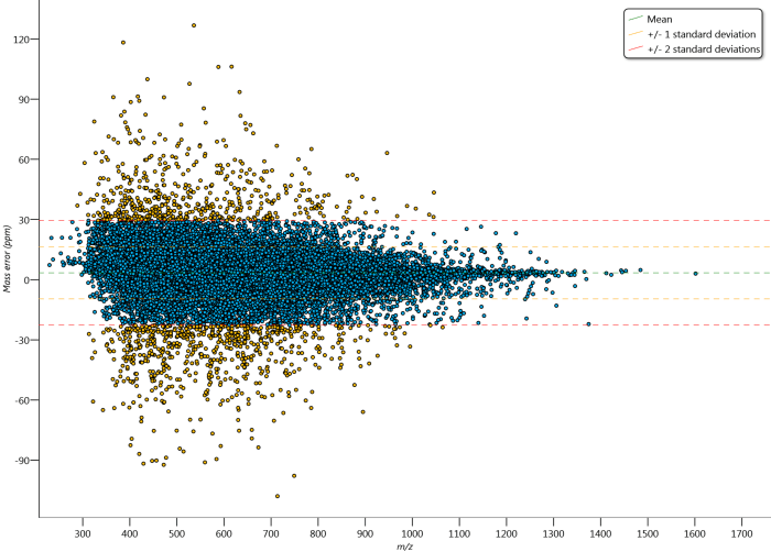
The Mass accuracy graph. The mean, 1 SD and 2 SD limits of the data are marked. Outliers relative to the 2 SD line are coloured yellow.