


How do I use the QC metrics precursor m/z chart?
This chart shows the distribution of your MS1 precursor m/z values, both identified and unidentified. Given the single aggregate codetection, this metric does not alter with experiment design – the value is based on the aggregate of runs.
Analogously to the Peptide ion dynamic range chart, this is a proportional distribution plot. Each bar represents the proportion of all peptide ions present that are within the binned m/z range. Identified peptide ions are marked in yellow to examine any correlation of m/z with successful identification.
The expected distribution shown on this chart is very much dependent on the m/z range optimised for your instrument and your identification strategy. Masking of regions in the detection may also affect the distribution of these values.
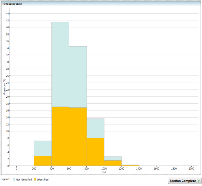
The (Overview) Precursor m/z chart.
See also
- How do I use the QC metrics screen?
- How do I use the QC metrics overview screen?
- How do I use the QC metrics identifications overview chart?
- How do I use the QC metrics LC peak width chart?
- How do I use the QC metrics peptide ion dynamic range chart?
- How do I use the QC metrics precursor retention time chart?
- How do I use the QC metrics mass errors chart?
- How do I use the QC metrics precursor charges chart?
- How do I use the QC metrics missed cleavages chart?
- How do I use the QC metrics peptides per protein chart?