


How do I use the QC metrics abundance dynamic range charts?
These histograms show the distribution and range of the normalised abundance of the peptide ions. Each histogram shows the abundances of peptide ions within a single condition from the current experiment design. The log10 of the mean normalised abundance value across the charted condition is used to bin each peptide ion, with the histogram scaled to show the proportion of the total number of peptide ions on the y-axis.
Successfully identified peptide ions are shown within the bars in yellow, to allow visualisation of the proportion of peptide ions that have been identified and any correlation between identification and abundance. In this case, only if there are successful MS2/MSE identification data within a run from that condition is the peptide ion counted as identified in that condition (see the Peptides chart description for more detail). It is therefore worth noting that if you carry out MS2 spectral export for identification purposes but limit the number of spectra exported, this chart may be affected.
The problems these charts might reveal include right skew or a curtailed distribution of the total density, potentially indicating saturation at high abundance. Also, if the proportion of identified peptide ions is relatively right-skewed, with relatively few at low abundance, you may wish to improve your identification coverage through inclusion/exclusion lists or different fragmentation strategies (for example). In the example shown identification success rate increases with abundance, as might be expected.
It is also possible to plot the raw (non-normalised) data instead of the normalised data, by switching off normalisation at the Filtering screen in the workflow (Review normalisation | Normalisation Method tab). For QC purposes, this may be of interest, given that drift in the raw data may be masked by normalisation [1,2].
These charts are relevant to both Sample preparation metrics and Instrument metrics, given that they can reveal saturation or under-identification but also characterise the relative abundance distribution of samples.
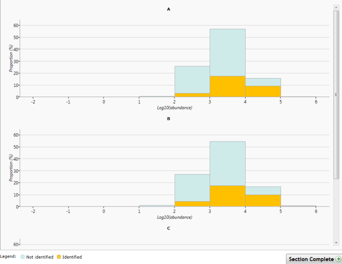
The Abundance dynamic range chart. Log10 mean abundance is plotted by condition for all peptide ions. Identified peptide ions are shown in yellow.
References
- Bramwell, D., 2013: "An introduction to statistical process control in research proteomics." J Proteomics 95: 3-21.
- Jackson, D. and Bramwell, D., 2013: "Application of clinical assay quality control (QC) to multivariate proteomics data: a workflow exemplified by 2-DE QC." J Proteomics 95: 22-37.